THE JOY PROJECT
Brand Strategy & Design
Website Strategy & Design
Meg came to RDD at a turning point in her business. The work she was absolutely incredible but her brand no longer reflected the depth, warmth and impact behind what she was doing. She needed a visual identity that felt as bold and impactful as the women she was working with!
We started with brand strategy. Getting really clear on the heart of The Joy Project, the people it serves and the feeling Meg wanted clients to experience at every single touchpoint. From there, we shaped a brand direction rooted in calm, connection and intention without losing the bold personality or presence.
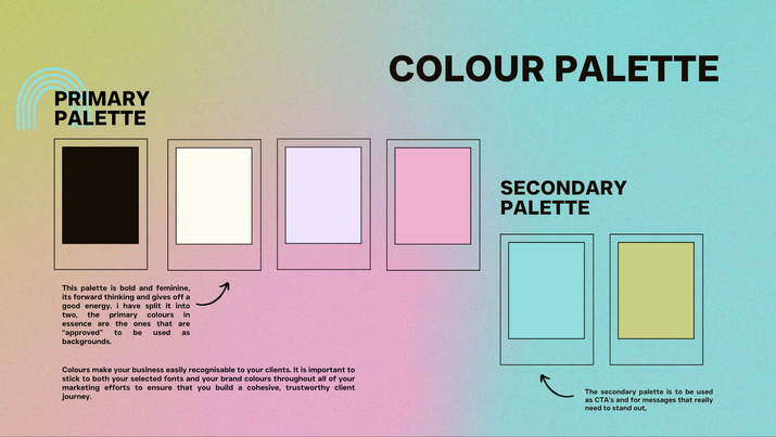
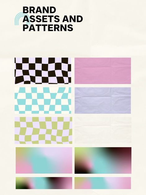
The visual identity was designed to feel grounded, nurturing whilst remaining powerful. Thoughtful typography, a considered colour palette and lots of extra design details came together to support the underlying message but we where conscious not shout over it.
The website followed suit, obviously, we wanted clear, intuitive and easy for Meg to manage, giving her the confidence to show up and share her work fully.
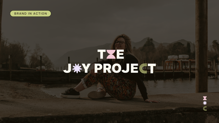
The result is a brand that feels aligned, intentional and deeply personal to both Meg and her clients. The Joy Project now reflects the impact of the work itself - creating space, connection and clarity for both Meg and the people she supports.

A brand designed to support meaningful work, without shouting for attention.


